
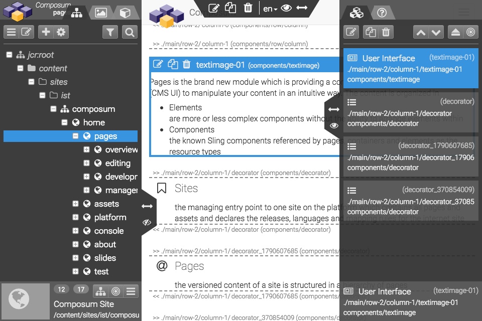
Composed components are general purpose containers or containers with special items within to create and edit complex content structures. The general container components - 'parsys' and 'iparsys' - are normally included as static content components in a page component to define the general page structure. The other components can be arranged and nested within this predefined containers of a page.
Section
A section component is a universal container to combine a set of elements. Such a section can be move, copied and referenced will all the elements within. There are some decoration options available to improve the attention or the recognition value of a section.
Each column of this page contains a set of sections one for each component type. Sections can be nested; the examples are nested sections inside of the 'Section' which is describing the 'Section' component.
Accordion
An accordion is a set of collapsible elements. There are three options / variations of an accordion
- independent:
each element in the accordion can be collapsed and expanded independently - accordion (default):
only one element can be opened at a time; opening an element is closing each other element automatically - tabbed:
the items are lined up as tab navigation elements; this variation is probably not so responsive
The elements of an accordion are paragraph systems of (normally simpler) element types.
This first item is configured as the initial open item in this accordion.

Carousel
Illustration
An illustration component combines an image with a set of 'hotspots' which are placed inside of the image and opening a popup window on click with a text message for the marked image detail.
The annotations - the 'items' of an illustration - can be added as separate elements inside of the illustration component. An item is placed using a percentage position property. The items can be numbered or illustrated by a symbol.
List
Table
A table component to create an HTML table element as a collection of rows with inserted cells. The rows are edited (inserted / moved / deleted) as the elements of the table itself. The cells are the elements of the rows an must be inserted also.
|
a table head row with title cells |
the head od column 2 |
|---|---|
|
a table data cell in column 1 |
another cell in column 2 |
|
a two columns cell |
|
|
a three rows cell |
a table cell conatins rich text like a 'text' compnent |
|
but such a simple table can't containe more complex elements |
|
|
there are some decoration options for a table |
|
