Pages Editing

The editing user interface of Composum Pages ist the central tool to browse through your repository und to manage your sites content.

The Pages Stage

The 'Stage' is the editing frame of the Composum Pages user interface. There are some tool panels arranged around your content page. The two sidebars on the left and on the right side and the Selection Toolbar on top the the Stages view.
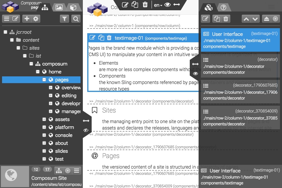
The Sidebars

You can resize both Sidebars with the Arrows Icon and move the Top Tool Bar. With the Eye Icon it is possible the enable/disable the overlay mode of the Panels. This means it is possible to say the Main Page Frame should start/end at the edges of the Panels or the Panels should slide over the Main Page Frame.

Navigation

The left sidebar contains the three main navigation tools:

Pages Tree / Search

The pages tree lets you browse through the pages hierarchy of the content repository. The selected page is shown in the main edit frame. The possible editing actions are available on the left side of the trees action bar. On the right side of the trees toolbar the scope of the tree is selectable (page, container, element) and you can switch to the page search view.

Assets Tree / Search

The assets tree lets you browse through the file resources of the content repository. Similar to the pages tree the possible editing actions of the selected element are available on the left side of the trees action bar. On the right side of the trees toolbar the scope of the tree is selectable (asset type) and you can switch to the asset search view.

A selected asset resource can can be assigned to an appropriate component by drag and drop them into a drop zone offered in the edited page by that component.

Component Selector

The component selector tab is offering the set of available components which can be inserted into the current page. The content of this set depends on the design policies of the pages template and the current page content. A user can choose some filtering options and search for component types.

A new component of one of the presented types can be inserted into an appropriate container by dragging the type from the selector into the container and drop the element at the designated position inside of the container.

Develop Tree

In the 'deleop' mode of the Pages edit stage view an additional tab is shown. In the development tree the component implementation resources can be edited. The pieces of a Pages content component can be managed, each template file can be edited in the code editor and the help pages of a component can be edited like content pages.

Main Edit View

In the centre of the Pages stage view the selected page is shown for content editing. The page can be shown in various display modes:

  • edit / develop
    in the 'edit' mode (and also in the 'develop' mode) the container elements are decorated and each editable element can be selected and modified
  • preview / browse
    in the 'preview' mode the page is shown in its final markup without additional editing hooks; the sidebars are not visible except in the 'browse' mode - in ths mode the page tree is still available to browse through the repository during preview