
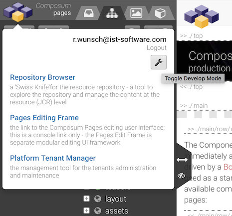
The 'develop' mode
If you have a developer role you can use den Composum Pages edit frame in the 'develop' mode. This mode is an extended 'edit' mode with additional tools and additional technical information in edit components.
You can switch on the 'develop' mode with the parameter pages.mode=develop in the edit frames URL or via the 'general tools' popup witch is shown on clicking the pages logo.
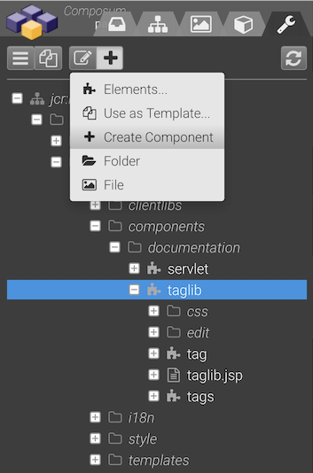
If the 'develop' mode is switched on you will see an additional tab in the main navigation sidebar. This devleop tree lets you browse through the resolvers search paths. The trees toolbar is offering a set of actions to create and manipulate components.
You can create a new component here. Create your folder to determine the 'parent part' of the designated resource type and then your new component.
A dialog is shown to input the properties of the new component. You can inherit from an existing resource super type; in this case the component type is the same as the super type. But if you not have a super type or if you want to define a different component type you have to choose one of:
- Element
- Container or
- Page
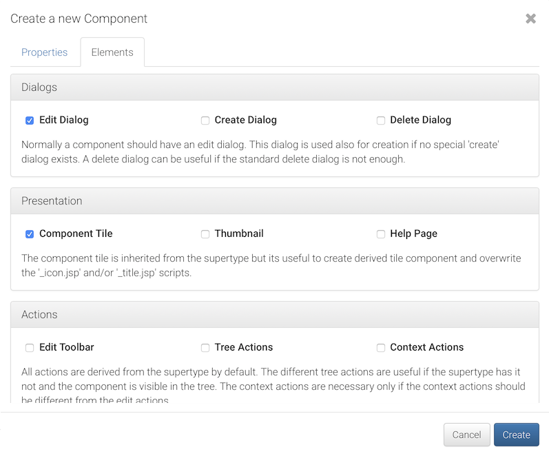
You can also select which edit component of a component you want to implement. For each selected edit component the implementation is prepared. This set can also be changed at any time later with the "Add / Elements..." tool.
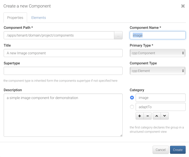
A new Image component
Our first component should be a simple image component (resource type: tenant/domain/project/components/image) to demonstrate component creation with featured editing functions like drop zones.
Let's create a folder
tenant/domain/project/componentsand our image component using the 'develop' tools with the properties:
- name: image
- component type: Element
- title: A new Image component
- description: a simple image component for demonstration
- category: Image, adaptTo
Edit the rendering script of the image component and replace the cpp:element tag by
...
<cpp:element var="model" type="com.composum.pages.commons.model.Image">
    <c:choose>
        <c:when test="${model.valid}">
            <div class="${modelCSS}_frame">
                <cpn:image class="${modelCSS}_picture" src="${model.src}"
                           alt="${model.alt}" title="${model.title}"/>
            </div>
        </c:when>
        <c:otherwise>
            <cpp:include replaceSelectors="placeholder"/>
        </c:otherwise>
    </c:choose>
</cpp:element>
...
It's a good idea to create a placeholder script in the components' main folder to have a handle during editing even if no element data are available.
<%@taglib prefix="cpp" uri="http://sling.composum.com/cppl/1.0" %>
<cpp:defineObjects/>
<cpp:element var="model" type="com.composum.pages.commons.model.Image" mode="none"
             test="@{model.editMode}" cssBase="composum-pages-components-placeholder">
    <span class="fa-stack ${modelCSS}_icon">
        <i class="fa fa-picture-o fa-stack-2x"></i>
        <i class="fa fa-plus fa-stack-1x add-plus"></i>
    </span>
</cpp:element>
We should insert the edit widgets for the components properties in the edit dialog component script into the cpp:editDialog tag.
...
    <cpp:widget label="Image" property="imageRef" type="imagefield"
                hint="the path to the image asset in the repository or an URL"/>
    <cpp:widget label="Title" property="title" type="textfield" i18n="true"
                hint="the title text normally shown as the elements tooltip"/>
    <cpp:widget label="Alt Text" property="alt" type="textfield" i18n="true"
                hint="the text used as alternative content in text based view"/>
...
Now the new component is available. Let's add a custom title (red bar) and icon (graduation-cap) to the tile title to make the new component a little bit more showy.
<%@page session="false" pageEncoding="UTF-8" %>
<%@taglib prefix="cpn" uri="http://sling.composum.com/cpnl/1.0" %>
<%@taglib prefix="cpp" uri="http://sling.composum.com/cppl/1.0" %>
<cpp:defineFrameObjects/>
<cpp:model var="model" type="com.composum.pages.commons.model.Image"
           cssBase="composum-pages-component-tile">
    <div class="${modelCSS}_title" style="background:#c00">${cpn:text(model.tileTitle)}</div>
</cpp:model>
Let's use our new component...
You can download the sources here:
use and extend
Usage and drop image assets
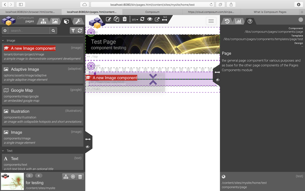
If you open the 'test' page an empty page will be shown (or the content edited before). But in the components tab in the navigation area our new component is offered to insert. Drag this component into the prepared 'column' container, edit the components properties and save - that's all.
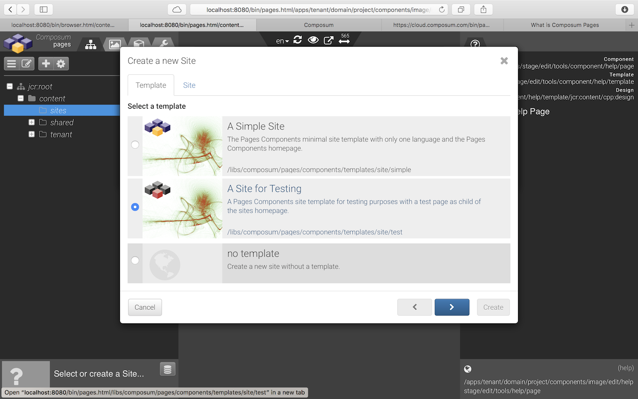
Let's use our new component on a content page. If not yet available you can create a site ('mysite') and a page with the 'Test Page' template (with an 'all components allowed' design). If you create a new site using the 'Site for Testing' template such a test page is created automatically during site creation.
Great, we've now used our first component in the testpage. But if we are dragging an image some other components are signalising that you can drop the image here - your component does that not (yet)...
Let's add a drop zone for images to our component to solve this.
<cpp:dropZone property="imageRef" filter="asset:image">
...
</cpp:dropZone>
Such a drop zone is simply declared by a JSP tag around the content area of our component. The final JSP file of or image component looks now like this:
<%@page session="false" pageEncoding="UTF-8" %>
<%@taglib prefix="cpn" uri="http://sling.composum.com/cpnl/1.0" %>
<%@taglib prefix="cpp" uri="http://sling.composum.com/cppl/1.0" %>
<%@taglib prefix="c" uri="http://java.sun.com/jsp/jstl/core" %>
<cpp:defineObjects/>
<cpp:element var="model" type="com.composum.pages.commons.model.Image">
    <cpp:dropZone property="imageRef" filter="asset:image">
        <c:choose>
            <c:when test="${model.valid}">
                <div class="${modelCSS}_frame">
                    <cpn:image class="${modelCSS}_picture" src="${model.src}"
                               alt="${model.alt}" title="${model.title}"/>
                </div>
            </c:when>
            <c:otherwise>
                <cpp:include replaceSelectors="placeholder"/>
            </c:otherwise>
        </c:choose>
    </cpp:dropZone>
</cpp:element>
Styling and a custom widget
We want to add some styling rules to our component. It‘s possible to add CSS-Files and extend die client libraries in the UI but we should now switch to normal IDE and enhance the image component ‚external‘ with build and deployment driven by Maven.
We want to use the project structure to develop an ‚app‘ and also to manage the content. Such a project can be created using the prepared maven archetype - - or downloaded from the Pages prototype repository:
.tenant-domain-project-components-image {
    width: 100%;
    text-align: center;

    &_frame {
        display: inline-block;
    }

    &_picture {
        width: 100%;
    }
}
The simplest way to embed your new style is the extension of the pages ‚view‘ clientlib. The clientlib category is normally specified in the sites configuration. Our test pages are using the Composum Components view client library.
To extend the components clientlib we create our own new clientlib with the same category (composum.pages.components.view) and a reference to the CSS file of our new image component.
{
  "jcr:primaryType": "sling:Folder",
  "sling:resourceType": "composum/nodes/commons/clientlib",
  "category": [
    "composum.pages.components.view"
  ],
  "css": {
    "jcr:primaryType": "sling:OrderedFolder",
    "embed": [
      "tenant/domain/project/components/image/css/image.css"
    ]
  }
}
After the next project build (and deploy) and a page reload the added style should be active and our new image components claims not more than the containers width.
Why we use JSP
That right, we are using JSP for component templating. There is a simple reason - JSP are extendable by tag libraries and this gives us the opportunity to merge editing hints and the markup language dynamically according to the various display modes. Furthermore the Taglibs are opening a way keep the code of the content components very clear, short and easy to understand.
The JSP taglibs are an important part of the Composum Pages component development framework. They are producing the markup for the editing UI but the code on the client side needs only this generated HTML code. Probably we will add support for alternative templating frameworks (HTL, Thymeleaf) in the future. (We have already some experiments for supporting HTL). Currently we are using the 'old' JSP - a well-tried scripting framework.
