
The 'book' theme of the Pages Components will serve us as an example of a theme implementation. This simple theme implementation adds an additional navigation bar on the left side of a standard content page like the table of contents of a book - here the table of contents of the area of a website configured with the 'book' theme.
The theme resource
Like a component, a theme is a resource in the search path of the resource resolver. As with components, themes can have their implementation in /libs overlaid by paths of the same name in /apps.
A theme itself consists of sets of overlays for
- resource types
- page templates
- clientlib categories
which are defined below the theme resource. The theme resource itself as the root element of the theme is of node type 'cpp:Theme'. Components, client libraries and page templates are arranged in a freely selectable structure below it.
In our example, the 'Book' theme, there are overlays below the theme resource
<?xml version="1.0" encoding="UTF-8"?>
<jcr:root xmlns:cpp="http://sling.composum.com/pages/1.0"
        xmlns:jcr="http://www.jcp.org/jcr/1.0"
        jcr:primaryType="cpp:Theme"
        jcr:title="Composum Pages Components Book Theme"
        jcr:description="a theme to navigate through a more complex set of content pages">
</jcr:root>for the 'content' page component and the default client library of the Pages Components.
The ‚book‘ Page-Component
The page component of the 'book' theme
<?xml version="1.0" encoding="UTF-8"?>
<jcr:root xmlns:jcr="http://www.jcp.org/jcr/1.0"
        xmlns:sling="http://sling.apache.org/jcr/sling/1.0"
        jcr:primaryType="sling:Folder"
        sling:resourceSuperType="composum/pages/components/page"
        overlays="[^.*/components/page(/home)?$]">
</jcr:root>overlays the default page component and the homepage component of the Pages Components and is itself derived from the default page component. The overlay is specified by the regular expression for the resource type to be overlaid in the 'overlays' property (Multi-value).
The resource types overlaid in this way are replaced dynamically during rendering by the resource type from the theme for the content areas to which the 'book' theme is assigned. The content elements themselves continue to refer to the original resource type, so they remain unchanged.
By deriving the theme component from the standard page component, it is sufficient here to merely adjust the rendering of the page content
<%@page session="false" pageEncoding="UTF-8" %>
<%@taglib prefix="cpp" uri="http://sling.composum.com/cppl/1.0" %>
<cpp:defineObjects/><%
    slingRequest.setAttribute("NARROW_MAIN", true);
%>
<div class="composum-pages-components-page_content">
    <div class="composum-pages-components-page_content_top">
        <cpp:include path="top" resourceType="composum/pages/components/container/iparsys"/>
    </div>
    <cpp:include resourceType="composum/pages/components/navigation/breadcrumbs"/>
    <div class="composum-pages-components-page_content-row row">
        <a class="composum-pages-components-page_content_nav_toggle fa fa-bars" href="#"></a>
        <nav class="composum-pages-components-page_content_nav col-xl-2 col-md-3 col-sm-12">
            <cpp:include resourceType="composum/pages/components/navigation/sidebar" replaceSelectors="showroot"/>
        </nav>
        <main class="composum-pages-components-page_content_main col-xl-10 col-md-9 col-sm-12">
            <div class="composum-pages-components-page_main-body">
                <cpp:include path="main" resourceType="composum/pages/components/container/parsys"/>
            </div>
        </main>
    </div>
    <div class="composum-pages-components-page_content_bottom">
        <cpp:include path="bottom" resourceType="composum/pages/components/container/iparsys"/>
    </div>
</div>and thus provide for the additional rendering of the navigation on the left side ('book' table of contents). At the same time, the request attribute 'NARROW_MAIN' is used to provide all components with a hint that the content area of the page is narrower than usual in the context of the theme. The Row component from the Pages Components then adjusts the responsive rendering of the columns slightly.
The 'content.jsp' rendering template of the default content page is replaced by this implementation in the page component of the 'book' theme for each corresponding content page configured with the 'book' theme without modifying the resource type in the content itself.
The ‚book‘ Clientlib
The client-side implementation of the components can be customized in the theme by overlaying the corresponding default clientlibs of the pages to be changed.
In our example, the 'book' theme, only extensions to the styles for the additional navigation and related Javascript functions for the responsive behavior of the navigation elements are added.
A new clientlib is defined for the 'book' theme, which overlays and inherits the default view clientlib of the Pages Components.
<?xml version="1.0" encoding="UTF-8"?>
<jcr:root xmlns:sling="http://sling.apache.org/jcr/sling/1.0" xmlns:jcr="http://www.jcp.org/jcr/1.0"
        jcr:primaryType="sling:Folder"
        sling:resourceType="composum/nodes/commons/clientlib"
        jcr:description="the Components clientlib for the Book theme of the common components"
        category="[composum.pages.components.book]"
        overlays="[^composum\\.pages\\.components\\.view$]">
    <css
            jcr:primaryType="nt:unstructured"
            depends="[category:composum.pages.components.view]"
            embed="[composum/pages/components/themes/book/components/page/css/page.css]"/>
    <js
            jcr:primaryType="nt:unstructured"
            depends="[category:composum.pages.components.view]"
            embed="[composum/pages/components/themes/book/components/page/js/page.js]"/>
    <link
            jcr:primaryType="nt:unstructured"
            depends="[category:composum.pages.components.view]"/>
</jcr:root>
Analogous to the components, overlaying is done the regular expression for the clientlib categories to be overlaid in the 'overlays' property (multi-value). The different aspects of the clientlib (css, js, link) derive with 'depends' from the overlaid clientlib and add the assets of the 'book' clientlib in the respective 'embed' property.
Overlaying templates is also possible in a theme. In our example, there was no use for it.
Powerful and useful
Any aspect of a component (render templates, edit dialog, toolbar, tile,...) can be customized by the overlaying component in the theme. A theme can be a separate project with any number of overlays of components, templates and clientlibs.
A theme can be used to efficiently modify the functionality, appearance and structure of existing content components. One and the same component can thus behave completely differently. The edited content remains completely unchanged.
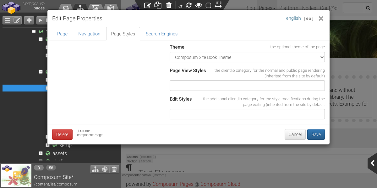
Each content page can reference such a theme.
These references are inherited by subpages. In this way, individual areas of a website can be given completely different properties with basically the same content.
