Dialogs and Widgets
Everything is a component - a dialog widget also. Widgets are used in the edit dialog components to declare the forms for property editing, see the following dialog examples:
<%@page session="false" pageEncoding="utf-8" %>
<%@taglib prefix="cpp" uri="http://sling.composum.com/cppl/1.0" %>
<cpp:defineFrameObjects/>
<cpp:editDialog title="@{dialog.selector=='create'?'Create a Link':'Edit Link'}">
    <cpp:widget label="Link Text" property="title" type="textfield" i18n="true" hint="the label of the link"/>
    <cpp:widget label="Link" property="link" type="linkfield"
                hint="the path of the links target page or an external link"/>
    <div class="row">
        <div class="col col-xs-8">
            <cpp:widget label="Link Title" property="linkTitle" type="textfield" i18n="true"
                        hint="the text for the link tooltip (optional)"/>
        </div>
        <div class="col col-xs-4">
            <cpp:widget label="Link Target" property="linkTarget" type="combobox" options="_blank,_parent,_top,_self"/>
        </div>
    </div>
</cpp:editDialog><%@page session="false" pageEncoding="utf-8" %>
<%@taglib prefix="cpn" uri="http://sling.composum.com/cpnl/1.0" %>
<%@taglib prefix="cpp" uri="http://sling.composum.com/cppl/1.0" %>
<cpp:defineFrameObjects/>
<cpp:editDialog var="model" type="com.composum.pages.components.model.reference.Reference"
title="@{dialog.selector=='create'?'Create a Reference':'Edit Reference'}">
<cpp:widget label="Path" property="contentReference" type="pathfield"
hint="the path of a content resource; recursive references or references to pages are not allowed"/>
<cpn:div test="${model.valid}" class="form-group">
<label class="control-label composum-pages-edit-widget_label"><span
class="label-text">${cpn:i18n(slingRequest,'Preview')}</span></label>
<div class="widget-addon reference-preview-widget-addon" data-path="${model.path}">
<cpn:image tagName="iframe" class="composum-pages-components-element-reference_preview-frame"
src="${model.path}.preview.html" width="100%" height="300px" frameBorder="0"></cpn:image>
</div>
</cpn:div>
</cpp:editDialog><%@page session="false" pageEncoding="utf-8" %>
<%@taglib prefix="cpp" uri="http://sling.composum.com/cppl/1.0" %>
<cpp:defineFrameObjects/>
<cpp:editDialog title="@{dialog.selector=='create'?'Create a Teaser':'Edit Teaser'}">
<cpp:editDialogTab tabId="teaser" label="Properties">
<div class="row">
<div class="col col-xs-8">
<cpp:widget label="Teaser Title" property="title" type="textfield" i18n="true"/>
</div>
<div class="col col-xs-4">
<cpp:widget label="Variation" property="variation" type="select" hint="render type"
options="default,bgimage,bgvideo,symbol" default="default"/>
</div>
</div>
<cpp:widget label="Subtitle" property="subtitle" type="textfield" i18n="true"/>
<cpp:widget label="Text" property="text" type="richtext" i18n="true" required="true"
height="120px"/>
<cpp:include resourceType="composum/pages/components/element/link" subtype="edit/dialog"
replaceSelectors="embedded"/>
</cpp:editDialogTab>
<cpp:editDialogTab tabId="image" label="Image">
<cpp:include path="image" resourceType="composum/pages/components/element/image" subtype="edit/dialog"
replaceSelectors="embedded"/>
</cpp:editDialogTab>
<cpp:editDialogTab tabId="video" label="Video">
<cpp:include path="video" resourceType="composum/pages/components/element/video" subtype="edit/dialog"
replaceSelectors="embedded"/>
</cpp:editDialogTab>
<cpp:editDialogTab tabId="icon" label="Icon">
<div class="row">
<div class="col col-xs-7">
<cpp:widget type="static"
value="Alternative to a teaser image or video a symbol can be used. The chosen symbol is not used if an image or video is referenced."/>
</div>
<div class="col col-xs-5">
<cpp:widget label="Symbol" property="icon" type="iconcombobox"
hint="<a href='https://fontawesome.com/v4.7.0/icons/' target='_blank'>'FontAwesome'</a> icon key"
options="at,asterisk,bookmark-o:bookmark,check,exclamation,eye,info-circle:info,lightbulb-o:lightbulb,question-circle-o:qestion,search,warning,wrench"
typeahead="/bin/cpm/core/system.typeahead.json/libs/fonts/awesome/4.7.0/font-awesome-keys.txt"/>
</div>
</div>
</cpp:editDialogTab>
</cpp:editDialog>Each widget is rendered using the 'widget' tag of the Pages tag library (cpp):
<cpp:widget label="Link Title" property="linkTitle" type="textfield" i18n="true"
            hint="the text for the link tooltip (optional)"/>
This 'widget' tag is using the WidgetManager service which is collecting all implemented widgets of a system to determine the implementation of a widget type and delegate the rendering to this implementation.
The widget implementation itself is a Sling component. The resource name of this component declares the widgets 'type'. Widgets are searched in the resolvers search path with the known overriding mechanism.
Pages Tools Definition
Similar to the tools set of the Composum Console (part Composum Nodes) the set of available tools in the Composum Pages editing frame can be configured, extended and restricted.
In the Console the children of each resource of the resource type composum/nodes/console/page are used as console tool definitions to embed additional tools in the console view; the Pages UI is embedding a hook to switch to 'Pages' from the Console:
<?xml version="1.0" encoding="UTF-8"?>
<jcr:root xmlns:jcr="http://www.jcp.org/jcr/1.0"
xmlns:nt="http://www.jcp.org/jcr/nt/1.0"
xmlns:sling="http://sling.apache.org/jcr/sling/1.0"
jcr:primaryType="sling:OrderedFolder"
jcr:description="the Composum 'Pages' navigation item for the Composum Nodes console view"
sling:resourceType="composum/nodes/console/page">
<pages
jcr:primaryType="nt:unstructured"
jcr:mixinTypes="[sling:Redirect]"
jcr:title="Pages"
sling:redirect="/bin/pages.html${path}"
categories="[nodes,pages]"
description="/libs/composum/pages/stage/edit/console/description"
order="{Long}150"
target="pages"/>
</jcr:root>The Composum Pages UI has a similar tools registry. The children of each resource of the resource type composum/pages/tools/collection are used as Pages tool definitions to embed additional tools in the Pages UI view; e.g. the Composum Platform Workflow extension is embedding the workflow inbox in the Pages main navigation on the left side:
<?xml version="1.0" encoding="UTF-8"?>
<jcr:root xmlns:sling="http://sling.apache.org/jcr/sling/1.0" xmlns:jcr="http://www.jcp.org/jcr/1.0"
        jcr:primaryType="sling:Folder"
        jcr:description="the tools declaration for tools to extend Composum Pages"
        sling:resourceType="composum/pages/tools/collection">
    <userView
            jcr:primaryType="nt:unstructured"
            sling:resourceType="composum/platform/workflow/pages/tools/inbox"
            categories="[navigation,browse,edit,develop]"
            iconClass="inbox"
            hint="Users Workflow Inbox"
            title="Inbox"
            order="{Long}20"/>
</jcr:root>
Also similar to the console in the Pages UI the category is important to declare the context in which the tool is useful. The combination of categories controls the tools visibility:
- navigation / context (one only):
the tool is placed on the left (navigation) or on the right sidebar (context); navigation tools are general tools - they must be independent from the current selection; the context tools are shown only if the element type category matches... - site / page / container / element (combination possible):
if one or more of the element type categories specified for a tool (useful for context tools only) the tool is shown if the current selection matches to one of the specified element types - preview / browse / edit / develop (combination possible):
if display mode categories defined the tool is shown only if the current display mode matches to one of the specified display mode categories
The access to the registered tools can be restricted by ACLs. If a child resource of a registered tools collection is not readable for the current user this tool is not available for that user in the user interface.
All tools of the Composum Pages edit frame are declared as described above. So it's easy to customise the editing user interface.
Examples
A custom Widget
The simplest way to implement a new widget is the creation of a new widget resource derived from an existing widget component. The demonstration example in the prototype project contains such a widget.
The 'confidentiality' widget is extending the standard 'select' widget. Some attributes of the 'select' widget are predefined in the new widget ('-t-/-d-/-p-' = 'tenant/domain/project'):
<?xml version="1.0" encoding="UTF-8"?>
<jcr:root xmlns:cpp="http://sling.composum.com/pages/1.0"
          xmlns:jcr="http://www.jcp.org/jcr/1.0"
          xmlns:sling="http://sling.apache.org/jcr/sling/1.0"
          jcr:primaryType="cpp:Widget"
          sling:resourceSuperType="composum/pages/commons/widget/select">
    <attributes
            jcr:primaryType="nt:unstructured"
            default="internal"
            options="secret,confidential,internal,public"
            required="true"/>
</jcr:root>
All resources of the primary type 'cpp:Widget' are registered by the widget manager using their names as the type key. All predefined tag attributes (the <attributes> node) are merged with the attributes specified in the 'widget' tag of the dialog which is using that widget (with precedence of the dialog attributes over the predefined attributes).</attributes>
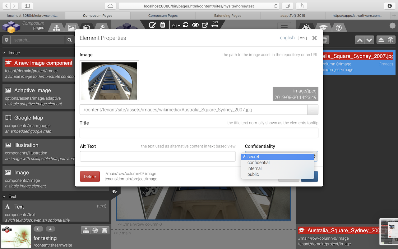
Let's add a new property to our new image component using the 'confidentiality' widget...
<%@page session="false" pageEncoding="utf-8" %>
<%@taglib prefix="sling" uri="http://sling.apache.org/taglibs/sling/1.2" %>
<%@taglib prefix="cpn" uri="http://sling.composum.com/cpnl/1.0" %>
<%@taglib prefix="cpp" uri="http://sling.composum.com/cppl/1.0" %>
<cpp:defineFrameObjects/>
<cpp:editDialog title="Element Properties">
    <cpp:widget label="Image" property="imageRef" type="imagefield"
                hint="the path to the image asset in the repository or an URL"/>
    <cpp:widget label="Title" property="title" type="textfield" i18n="true"
                hint="the title text normally shown as the elements tooltip"/>
    <div class="row">
        <div class="col col-xs-8">
            <cpp:widget label="Alt Text" property="alt" type="textfield" i18n="true"
                        hint="the text used as alternative content in text based view"/>
        </div>
        <div class="col col-xs-4">
            <cpp:widget label="Confidentiality" property="confidentiality"
                        type="confidentiality" required="false"/>
        </div>
    </div>
</cpp:editDialog>
... and we can use our new widget:
Such a widget component can be arbitrarily complex. Necessary CSS or JS code should be added to an appropriate client library. All widgets of the Composum Pages component development framework are implemented as such components - look at the 'Commons Widgets' of the Pages implementation to find examples:
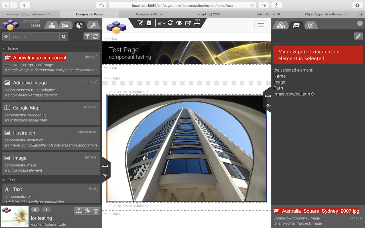
An additional Context Tool
As an example let's create a new panel (a tab) in the context tools area (right sidebar) which is shown if an element (not a container) is selected in 'de' edit mode.
We need a Sling component which is implementing the new context tool:
<%@page session="false" pageEncoding="UTF-8" %>
<%@taglib prefix="cpn" uri="http://sling.composum.com/cpnl/1.0" %>
<%@taglib prefix="cpp" uri="http://sling.composum.com/cppl/1.0" %>
<cpp:defineFrameObjects/>
<cpp:element var="model" type="com.composum.pages.stage.model.edit.FrameElement" mode="none"
             cssAdd="composum-pages-tools">
    <div class="composum-pages-tools_actions btn-toolbar">
        <div class="composum-pages-tools_right-actions">
            <div class="composum-pages-tools_button-group btn-group btn-group-sm" role="group">
                <button type="button" class="fa fa-pencil composum-pages-tools_button btn btn-default"></button>
            </div>
        </div>
    </div>
    <div class="${modelCSS}_panel composum-pages-tools_panel">
        <cpn:text tagName="p" i18n="true" value="My new panel - visible if an Element is selected."/>
        <cpn:text i18n="true" value="the selected element:"/>
        <dl>
            <dt>${cpn:i18n(slingRequest,'Name')}</dt>
            <dd>${cpn:text(model.name)}</dd>
            <dt>${cpn:i18n(slingRequest,'Path')}</dt>
            <dd>${cpn:text(model.pathHint)}</dd>
        </dl>
    </div>
</cpp:element>
This simple panel is presenting a headline and the path and name of the selected element. The DIV element structure adopted from the other Pages tools - this makes it easy to integrate the new tool using the CSS style of the other tools.
After adding the resource which describes our new tool...
<?xml version="1.0" encoding="UTF-8"?>
<jcr:root xmlns:sling="http://sling.apache.org/jcr/sling/1.0" xmlns:jcr="http://www.jcp.org/jcr/1.0"
        jcr:primaryType="sling:Folder"
        jcr:description="the tools declaration for the example tools"
        sling:resourceType="composum/pages/tools/collection">
    <mycontext
            jcr:primaryType="nt:unstructured"
            sling:resourceType="tenant/domain/project/tools/mycontext"
            categories="[context,element,edit,develop]"
            iconClass="graduation-cap"
            hint="A context tool example"
            title="My Context"
            order="{Long}200"/>
</jcr:root>
... and with a small extension of the Pages client library for the edit frame composum.pages.edit.frame...
<?xml version="1.0" encoding="UTF-8"?>
<jcr:root xmlns:jcr="http://www.jcp.org/jcr/1.0"
          xmlns:sling="http://sling.apache.org/jcr/sling/1.0"
          jcr:primaryType="sling:Folder"
          sling:resourceType="composum/nodes/commons/clientlib"
          category="[composum.pages.edit.frame]">
    <css
            jcr:primaryType="sling:OrderedFolder"
            embed="[tenant/domain/project/tools/mycontext/css/mycontext.css]"/>
</jcr:root>@charset "UTF-8";
.tenant-domain-project-tools-mycontext {
p {
padding: 0.5em 1em;
font-size: 17px;
font-weight: bold;
background: #c00;
}
}...our new context tool is working and looks like this: